4 Ways to Visualize Geographical (Location) Data in Excel 2013
Excel 2013 brings forward an array of new and exciting features at the finger tips of the data analysts, ranging from a shiny new visualization and exploratory data analysis platform (PowerView) to a number of new pivoting features as well as a powerful in-memory data modelling engine (PowerPivot) enabled by default.
Among all these features, the new Excel delivers a few different options for visualizing geographical and location based data, each visualization technique serving a different purpose (with a specific set of features) or targeting a particular demographic segment of the over-all Excel user-base. This is a short post introducing some techniques for visualizing geo information in Excel.
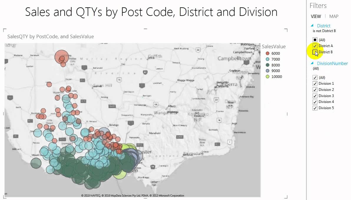
Maps in Power View
The Maps control in Power View offers an interactive and exploratory approach to visualizing geographical data, all wrapped up in the very shiny Silverlight-based chrome of Power View.

Being in PowerView, this offers the user the ability to create clever filters, slicers and dicers that aids in exploring the map visualization. The map control here is customizable with different overlays (from heat maps to pie charts, etc.), and can be tiled over some dimensional values, amongst many other features worth experimenting with.
Another bonus with having a map visualization embedded within PowerView is that you could easily export this to PowerPoint, allowing you to share the the visualization within your presentation in a very neat way. You will need to have the Tabular Model (possibly created in PowerPivot) uploaded to SharePoint in order to have an interactive visualization within PowerPoint.
There is a neat little video that demos how to build out a map visualization using PowerView on Excel 2013 which could help you get started with Geo data in PowerView.
GeoFlow Visualization
The Excel GeoFlow project is aimed at creating stunning (albeit less useful) geo-based visualization of data. It is sort of a trade-off between looking cool and being actually useful.

There is an excellent article by Graham Lannigan that explains the pros and cons of using GeoFlow as a map visualization tool, the main purpose of this visualization tool is to provide a cool 3D model of the Earth, with visual elements embedded within it.
GeoFlow also does some awesome time-based visualization in the style of a “short film” (PowerView Maps also supports time-series based analaysis as a slider), as well as allowing users to embed charts and other visual elements to aid in geo data analysis.
My personal opinion about GeoFlow is that it is still in its early stages and requires some work, its a neat and visually striking tool, but its not fit for purpose as a data-analysis tool, particularly if your data is geographically sparse.
Bing Maps Excel App
If you’re looking for a way to display geo data on a map in a classic Excel sheet, then the Bing Maps Excel 2013 App is the answer.

Functionality quite (but not exactly) similar to PowerView’s Map control, Bing Maps allows users to create on the fly map visualization right on the data sheet itself, a very powerful tool for data analysts, particularly ones that are trying to really understand the data, before formalizing their visuals in one of the “meatier” options (such as GeoFlow or PowerView Maps).
One cool element of this app is that since it uses the native Bing Maps api, it is actually “touch-screen” friendly, allowing you to zoom in/out or move about the map using finger gestures.
Geographic Heat Map Excel App
Geographic Heat Map is yet another Excel 2013 app intended to display geographical data.
Unfortunately the Geographic Heat Map app is still quiet a young product, which means it lacks some of the features other map visualization tools might have, such as different overlays or global coverage (Geographic Heat Map only covers the US map), but I would definitely keep an eye on it as an alternative way to visualize geographical data.
That it for now, although given how easy building apps is for Excel 2013, I reckon there will be many more map visualization apps coming out soon. I strongly urge you to check out the Excel App Store for a host of visualization and productivity apps that could be really useful.


You can download SVB Surface. Works with Excel 2010. It will allow you to prepare advanced heatmaps using number of formats of data.
I found the CityMarker on http://www.maps4office.com to be quite the alternative to the four solutions above. It looks quite much like the Excel App but runs in PowerPoint (pulling my Excel data). It’s got heatmaps too and you can mark different locations (in my case customer addresses)… My colleagues were quite impressed with the results if that counts for anything
Hm, we have great map library on http://exceldashboardschool.com/excel-map/
These templates are free!
Visual Crossing (who I work for) also have another option if you are looking for maps in Excel. Our map add-in is available at a very low monthly cost with a free trial and allows easy set up directly in Excel with rich visualization and geospatial analytic capabilities.
Regards
Andrew